Visual System for a Foundation Raising Funds for Drones for the Ukrainian Defense Forces
About the Project
“Sternenko Community” is a charitable foundation focused on fundraising for FPV drones and other equipment used to eliminate enemy forces.
When I joined the team, there was no visual communication system in place. The foundation itself had only recently been established.
There was no:
- unified visual style
- templates
- visual logic
- recognizability
My goal was to create a cohesive visual system that directly supports fundraising efforts.
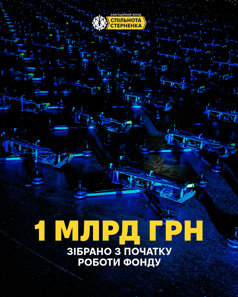
My Role
I worked as part of the team and was responsible for the design and visual side of communication:
- developing the visual style
- creating graphics for social media
- designing materials for fundraising campaigns
- contributing to content presentation
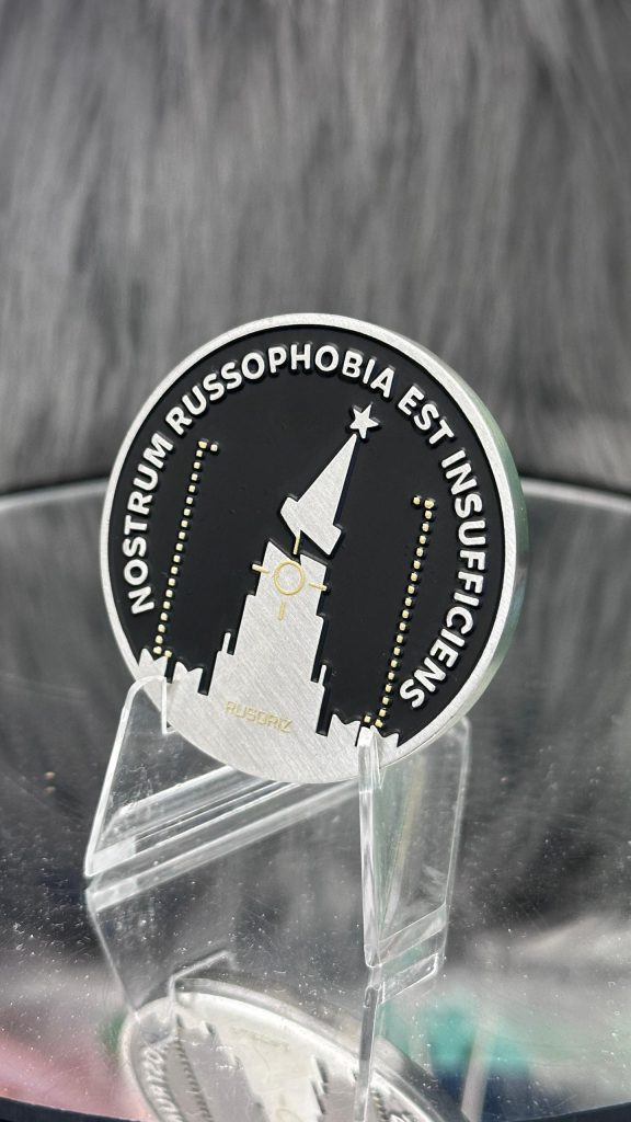
- designing merchandise and award materials for the foundation\
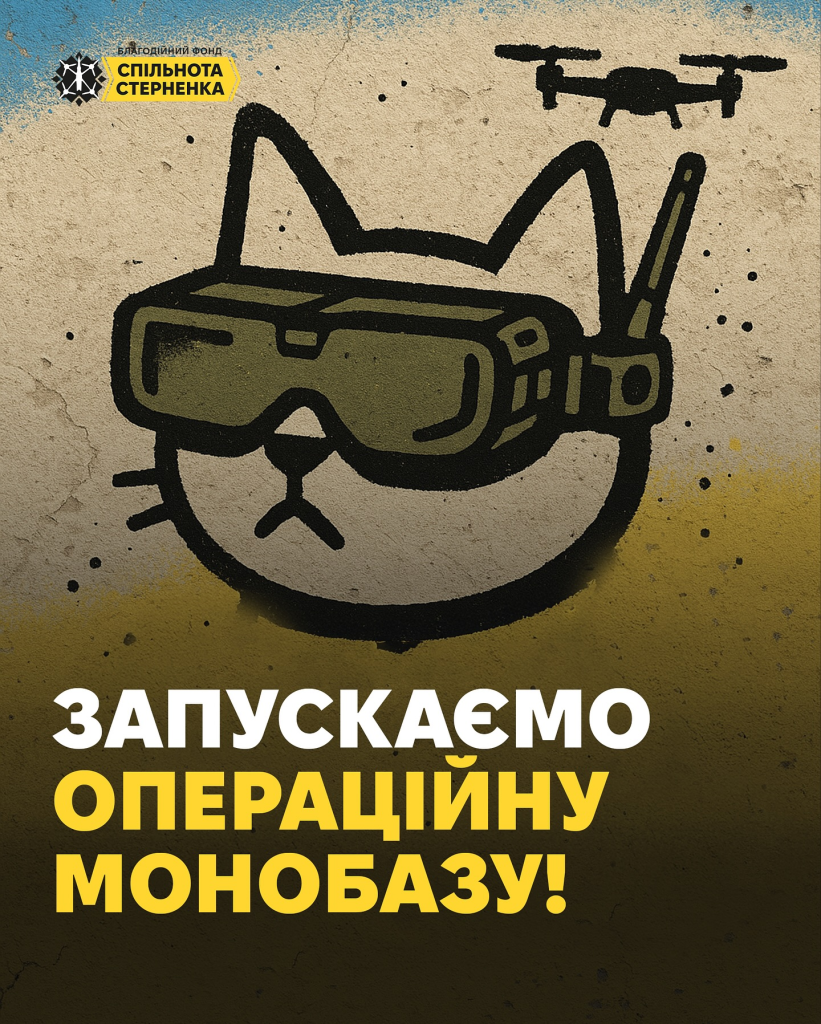
The Challenge
The goal wasn’t just to “make things look good.”
I needed to:
- make visuals understandable within seconds
- stand out in crowded social feeds
- reinforce the meaning and urgency of fundraising campaigns
- work fast, without time for a long branding process
An additional challenge was that the foundation is associated with one of the most prominent public figures in modern Ukraine, which raised the expectations for quality and consistency.
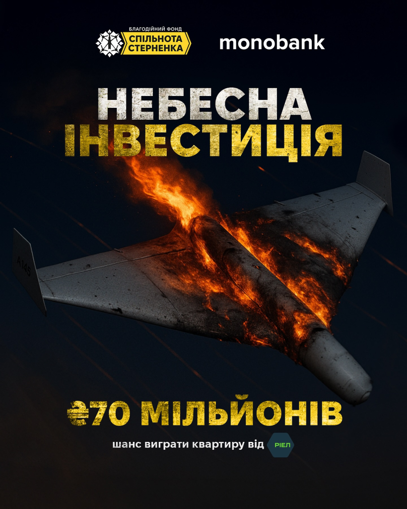
What I Did
I approached this as building a system, not creating isolated designs.
1. Established a Visual Language
Defined core principles:
- focus on key information (amount, goal, outcome)
- minimal unnecessary elements
- strong contrast and readability
- fast visual perception
Each design functions more like an interface than just an image.
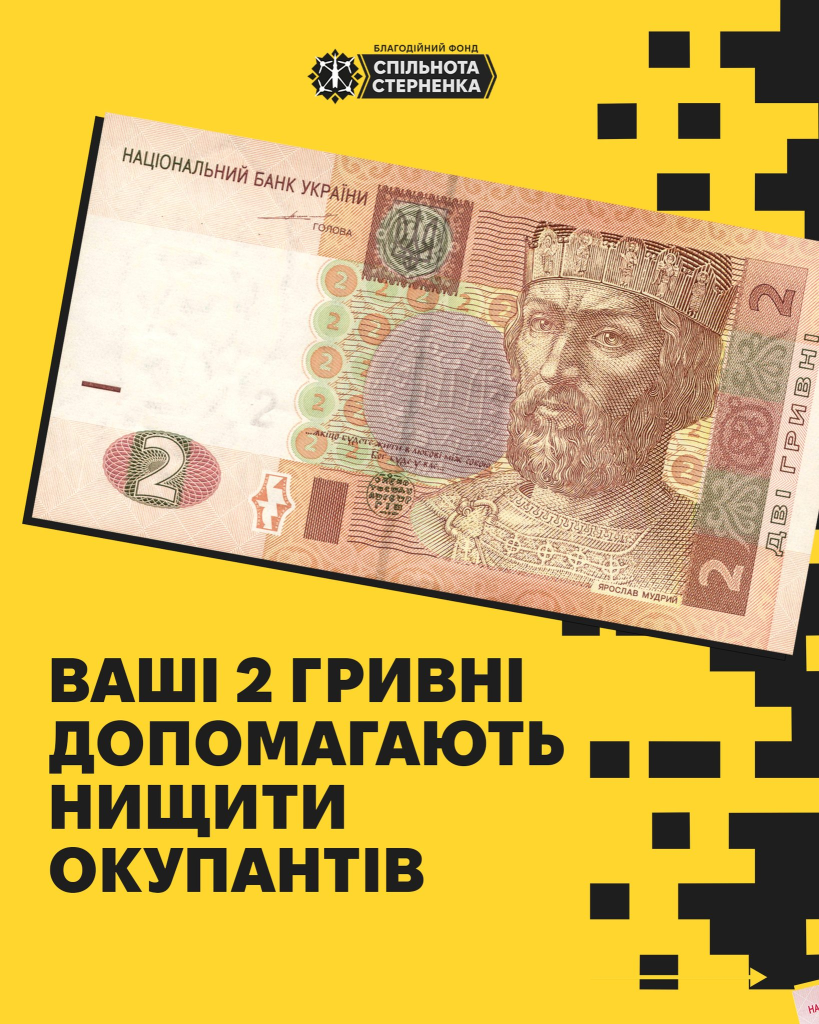
2. Created Scalable Templates
To ensure speed and consistency, I developed:
- templates for fundraising posts, reports, and updates
- variations for different use cases
- flexible, reusable compositions
This made it possible to scale content without losing quality.
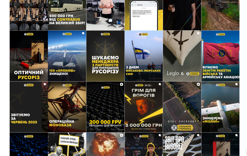
3. Made Design Functional
Each visual answers key questions:
- what is needed
- how much is needed
- what it will achieve
No overload, no decorative elements without purpose.
4. Unified the Style
- consistent color logic
- similar compositions
- repeatable visual patterns
As a result, the foundation became recognizable even without a logo.
5. Worked Across Multiple Formats
- social media
- banners
- campaign materials
- merchandise
Maintaining consistency across all touchpoints was essential.

Result
The foundation gained:
- a recognizable visual identity
- fast and scalable design production
- clear and effective fundraising visuals
- a unified communication logic